Our final
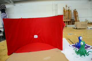
idea was to have an alien pressing a light switch back and forth and changing
colors every time the switch is pressed, my partner and me agreed on the
storyboard and the idea to fix it up to become more simplistic and easier. But
overall we managed to stick to our production schedule mostly but were needed
to reshoot twice and this caused us to set us back quite a bit. If I could've
improved on something it mostly be the lighting and the tentacles of the alien
other than that the smoke scene could've used a sort of sound effect that
established the e4's arrival.
My roles
in the project were to be in model creation/designer and director of animation.
Both of which I feel that I did a considerably good job on these, if I could've
handled the camera better maybe the quality of filming could've been improved,
but I wasn't very accustomed to the equipment which set us back a bit.
I feel
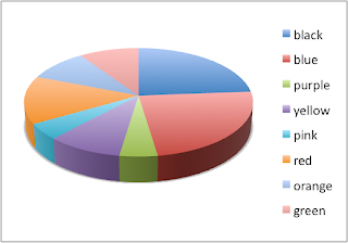
that this video really fits into what our target audience wants which were
comedy, sci-fi and the color blue, green and red. This generate ideas which
lead towards the final outcome.
The final
outcome of the work for my partner and me.
This is
the Final Video for the project
My
partner and me had to show this work to the class and they gave their opinions
and critiques on it, these are the comments on the video from them. If I could
I would reshoot this and take in and use the comments from this video to make
it better. I will also back up my reasons to why I would not agree to some view
on are work, or why I would agree to some.
Views of
others
"This was neatly done and the idea is
original, maybe more sound in the background?"
Are response to view-We
feel that there shouldn't be any background sound as it will take away the
impact and the attention from the sounds that the alien makes, in this case
less is more and that’s why we took out the background sound.
"Needs sound effects for smoke"
Are response to view-We
agree with this and we want to redo this to put the sound effect in but as for
time to do this we don't have so much.
"I like the animation but you could revise the
way that the e4 icon appears as it seems that some other ways that it appears
could be more interesting"
Are response to view-We
agree, but after the 2nd reshoot we didn't have much time to rethink of other
ways. One ways that was suggested was that the lights would go out and on and
the e4 would be there but we could not just have it come out simple its was a
bit of a hard idea to make happen.
"The tentacles could've been modeled better or
the movement could be smoother"
Are response to view- The
reason why they were like that was that we wanted to let the tentacles to move
around simple, but is was difficult to move the tentacles without it moving
downwards ever if we placed wine with in them the plaster would still be heavy
so we made them thin and simple.
Other praises for the work have like: "Fits
the e4 brand identity" "Good sounds/voices" "I liked the
way the eye moves around realistically"


